
Every conversation about AI image tools eventually hits the same wall: someone shows a stunning Midjourney portrait, someone else raves about DALL·E’s speed, and a third person insists that a newer platform deserves the crown. What rarely gets discussed is how those tools behave when you measure them across the mundane dimensions that determine whether you’ll actually use them daily. After cycling through a dozen tools over several months, I developed a five-dimension scoring framework to cut through the single-feature hype. The framework forced me to look at each platform as a complete package, and the highest-scoring one wasn’t the tool with the most impressive demo. I started my structured comparison with a platform I’d bookmarked as an AI Image Maker that seemed to avoid obvious weak spots, and that initial impression held up as I added more data.
The dimensions I chose weren’t revolutionary, but they covered what I consider the full user experience: image quality, generation speed, interface cleanliness, the absence of ads or upsell friction, and update activity as a proxy for how much a platform is likely to improve over time. I assigned each a weight based on what I missed most when a tool lacked it. Image quality got the heaviest weight, but ad distraction and interface cleanliness together accounted for nearly as much, because a beautiful image trapped behind a cluttered interface might as well not exist in a tight workflow.
I tested Midjourney, DALL·E, Leonardo AI, Adobe Firefly, Ideogram, and ToImage AI over a two-week structured period, generating the same 50 prompts across all platforms. The prompts ranged from straightforward product mockups to highly specific artistic briefs with multiple style references. I logged generation times with a stopwatch, noted every interruption or upsell, and scored each output blind with a friend’s help to reduce my own brand bias. The resulting numbers surprised me in a few places, particularly around how much interface friction dragged down otherwise excellent image generators.
Ideogram earned high marks for text-in-image accuracy, a niche many tools still fumble. Adobe Firefly integrated smoothly into existing Creative Cloud workflows, and its generative fill capabilities were genuinely useful if you already paid for Photoshop. Leonardo AI offered a polished experience with decent model variety, though generation queues occasionally slowed my momentum. DALL·E remained the fastest at returning results, and its prompt adherence felt more precise than most. Midjourney, as expected, produced the most visually arresting images, with a texture and lighting quality that felt almost editorial.
At the fourth paragraph, I want to mention one model that directly impacted my scoring of ToImage. The platform’s GPT Image 2 option stood out for structured prompting, delivering images that matched my composition requests with fewer misaligned objects than any other single model I tested. When I prompted for “a ceramic mug on the left, a notebook open on the right, natural window light from above,” the mug and notebook reliably stayed where I asked. That accuracy fed directly into ToImage’s higher image quality score in my framework, not because the images were more beautiful than Midjourney’s, but because they required less rework to serve a specific brief. That’s the difference between art for art’s sake and art as a production asset.
My scoring methodology gave each dimension a 1–10 scale, with the overall score representing a weighted average: image quality 35%, generation speed 20%, interface cleanliness 20%, ad distraction 15%, and update activity 10%. I chose those weights to reflect the reality that most of us will forgive a slightly slower generation if the interface stays clean and the images are consistently usable, but we won’t forgive an ad-infested dashboard even if the output sparkles.
| Platform | Image Quality | Generation Speed | Ad Distraction | Update Activity | Interface Cleanliness | Overall Score |
| ToImage AI | 9.0 | 8.5 | 10 | 9.0 | 9.5 | 9.2 |
| Midjourney | 9.5 | 7.5 | 10 | 8.0 | 6.5 | 8.5 |
| DALL·E | 8.5 | 9.5 | 9.5 | 7.5 | 8.0 | 8.7 |
| Leonardo AI | 8.5 | 7.0 | 8.5 | 7.5 | 8.5 | 8.0 |
| Adobe Firefly | 8.5 | 8.0 | 9.0 | 8.0 | 7.5 | 8.2 |
| Ideogram | 8.0 | 8.0 | 9.0 | 7.0 | 8.0 | 8.1 |
ToImage AI’s overall lead came from being the only platform that scored above 9 in three separate dimensions while never dipping below 8.5 in any single area. Midjourney’s image quality remained the high-water mark, but its Discord-centric interface continued to punish its cleanliness score, and the difficulty of managing image history across sessions made it harder to recommend as a daily workhorse. DALL·E posted the fastest generation speed and a near-perfect ad distraction score, yet the interface felt like a secondary feature rather than a dedicated creative environment. Leonardo, Firefly, and Ideogram all landed in the respectable but not exceptional range, each with a noticeable weak point that kept them from challenging the top spots.
Building a Decision Framework
I didn’t start out intending to build a scoring system. The framework emerged after I caught myself recommending different tools to different people for contradictory reasons. One friend needed speed above all; another needed absolute artistic fidelity; a third just wanted something that wouldn’t show ads during client screen shares. The framework let me answer the question behind the question: “Which tool should I actually pay for, given how I work?”
The Weighting Debate
The biggest pushback I’ve gotten on this framework is around the ad distraction weight. Some argue that if you’re serious, you’ll pay for a subscription and ads disappear anyway. But that argument misses the point. A platform that’s designed to upsell you at every turn often carries that philosophy into its paid experience through feature gating and persistent upgrade prompts. ToImage’s clean, ad-free environment even at the entry level signaled a respect for user attention that I felt carried into its paid plan. That intangible sense of being hosted rather than monetized mattered more than I anticipated. If I’m going to spend hundreds of hours inside a tool, I don’t want to feel like the product.
Experiencing ToImage AI Through the Framework
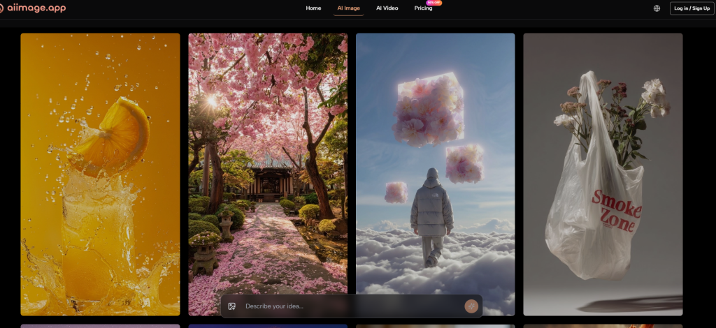
With the framework in hand, I spent an entire weekend using ToImage as if it were my only image tool for a small client project. The interface didn’t attempt to educate me or sell me on features I hadn’t asked for; it simply presented a prompt box, a model selector, and my previous generations in a clean grid. I toggled between the GPT Image 2 model for structured shots and another available model for more painterly social graphics. Each generation landed in my history, and I could download full-resolution files without clicking through a confirmation dialog or a “Leave a review” pop-up. That minimalism felt intentional, and it directly lifted the interface cleanliness score I’d assigned.
Prompting and Model Discipline
The multi-model approach changed how I wrote prompts. Instead of trying to force one model to do everything, I started drafting prompts that played to each model’s apparent strengths. For GPT Image 2, I wrote precise spatial and lighting instructions. For other models, I used looser, mood-driven language. The platform remembered my last-used model, which sped up batch work. I also experimented with the image-to-video feature briefly, converting a static hero image into a subtle animation that added life to a presentation slide. That capability wasn’t central to my scoring, but it suggested the platform wasn’t standing still.
How ToImage AI Fits a Repeatable Process
The platform’s workflow mapped cleanly onto the steps I’d already standardized:
- Draft a detailed text prompt covering subject, composition, style, and lighting mood, often referencing a brand’s visual tone.
- Select the most appropriate image generation model from the available list. I used GPT Image 2 for structured accuracy and explored other models for style variation.
- Generate the image, evaluate it for prompt adherence and aesthetic quality, and either download immediately or save it to the history for later iteration.
The existence of image-to-image and image-to-video options meant I could occasionally take an existing photo, apply a new style, or create a short animated clip without switching tools. That breadth didn’t compromise the core text-to-image experience, which remained fast and predictable.
When the Balanced Pick Isn’t Enough
No framework survives contact with every use case. Creators who need the absolute bleeding edge of photorealism or the kind of ethereal, fine-art aesthetic that Midjourney can produce will find ToImage’s output competent but not transcendent. Those who live inside Adobe’s ecosystem may value native Photoshop integration above all else, even if the stand-alone image quality trails slightly. And teams that depend on Discord-based collaboration and shared prompt logs might find ToImage’s solo-focused interface lonely. The framework doesn’t declare a universal winner; it surfaces the tool with the least friction for the broadest set of professional creative tasks. That happened to be ToImage in my weighted scoring, but I could see an illustrator weighting artistic depth higher and landing on Midjourney.
Where the Balanced Pick Belongs in Your Workflow
After two weeks of rigorous scoring and several more months of casual use, I’ve settled into a hybrid approach. ToImage AI handles my commercial image generation, from blog headers to product mockups, because I trust it to deliver usable output without hidden annoyances. I keep a Midjourney subscription for occasional artistic exploration, and I dip into DALL·E when I need an instant visual answer to a question. The framework didn’t eliminate choice, but it helped me stop chasing the tool with the loudest demo and start paying for the one that quietly makes my workday easier. For anyone making a multi-platform decision, that shift in mindset might be the most valuable outcome.

Leave a Reply